Window Display

Window Display

Saturday, February 8, 2014


This may come as a SHOCK!

But College Students are expected to spend 2-4 hours per credit OUTSIDE of class... STUDYING!

This means that for THIS class, you should be spending 6-12 hours a week outside of class on readings, studying for quizzes and, yes, working on your projects.

SO - when I give you a two week project, it should take you at least 12 hours to complete.

I have been teaching for nearly 20 years. Trust me when I say that I can estimate the amount of time you've spent on a project by looking at it. I will grade it accordingly. 

There is an enormous difference between College and High School.


The Average College Time Put Into Homework vs. High School

by Courtney O'Banion Smith, Demand Media
Finishing homework at the very last minute won't work in college.
In high school, you may have finished homework in the hall right before class on more than one occasion and still earned a good grade; that just isn't possible in college. College freshmen are usually shocked at how much time they are expected to spend on coursework outside of class. You can expect to spend as much time on homework in college as you would at a job.

Two-or-Three-for-One Rule

The Teaching and Learning Center of the University of Oregon recommends that you spend at least two to three hours per course hour reading, studying or doing homework. Likewise, the University of Michigan-Flint recommends between six to nine hours of study time per week per three-credit hour course. Therefore, a full-time student taking four courses will devote, on average, between three to five hours per day working on coursework in addition to class time. Although these figures may seem high compared to high school, they are not outlandish considering what you will have to do during that time.

Lectures

Many high schools offer an open period or study hall, and you can study or finish homework during that time. Also, many teachers may give you time during their classes to work on homework or read. However, in college, you must complete all the assignments and reading before coming to class, as the professor reserves class time for lecture or discussion.

Read, Read, Read

You will read a lot more per class in college than you did in high school. Also, the content of the text will be more complicated and difficult to understand. As a result, reading will take you longer. If you skim, you won’t understand or remember important information that will be on the test or discussed in class, and your grade will reflect your lack of effort. Remember that just because assigned reading is never discussed in class or mentioned in lecture doesn't mean it won’t be on the test.

Nothing But Tests

Some professors will not require minor homework assignments in addition to the readings but will give only major tests. This means that reading, review and study time are even more crucial, as flunking just one test will negatively affect your overall grade in the course, possibly beyond redemption.

Long and Short of this - I 

Creating a Window Display

QUIZLET!

Types of Displays

One Line Item Display 

• Showing or advancing a single garment or item

Line of Goods Display

• One type of merchandise - ie all blouses, all pots and pans

Related Merchandise Display

• Items shown together because they are meant to be used together

Variety or Assortment Display

• melange of anything and everything

Promotional vs. Institutional Displays

Types of Display Settings

Realistic Setting

• a room, area or other recognizable locale

Environmental Setting

• merchandise presentation that shows an assortment of various related items in a setting depicting how and where they may be eventually used.


Semi-realistic Setting

• a vignette setting that indicates while leaving the imagination to fill in the details

Fantasy Setting

• creative, fantasy, surreal

Abstract Setting

• an arrangement that does not look like anything in particular but evokes certain feelings


Build-up Display

• An overall display that has a build up of product - like blocks


Read Chapter 5 and 6 in the textbook 

Monday, February 3, 2014

Week Four - Light and Lighting


QUIZLET

The Color Of Light

• Light makes things visible
• All color depends on light

Kinds of Light

1. Natural Light
2. Artificial Light
• incandescent
• florescent
• high intensity discharge (HID)

Visible Light


• Is composed of the whole spectrum of light from violet to red.
• All light is caused by waves of radiant energy that vary in length from shortest (violet) to longest (red)
• Ultraviolet, x-rays and gamma rays are too short to see, infrared and radio waves are too long.

Some light sources reflect the shorter waves and appear more blue, some the longer and have a warmer tone.

The Color of an Object 

Is the result of the object's absorption of color waves:
 i.e - a blue object absorbs all the waves but the blue ones
Black absorbs all waves
White reflects all waves

Planning Window Lighting

An unlit or poorly illuminated window becomes a giant one-way mirror.
The cheapest and most effective way to get attention and recognition is good lighting

The Open Back Window


Lighting in the display area must be strong enough and bright enough to attract and keep the eye from going past the feature merchandise.
• focus light away from the glass
• avoid lighting the mannequin's face - chest lighting is best.
• place the merchandise as far back as possible to prevent conflict with daylight
• create a backdrop with fabric, screen, wood, plants

The Closed Back Window


A great opportunity for magical lighting effects
• Paint the background with light
• dramatize the scene using colored lights or gels
• used patterned filters or gels
• put the merchandise as far back as possible

Planning Store Interior Lighting


Light

Directs the shopper's attention from one presentation to another, points out focal points and displays

Store Lighting Plan

Includes overall illumination of the space and also the accents that point things out.
• wall lighting can show off wall stock
• careful lighting necessary at "moment of truth" spots.

General or Primary Lighting

All over illumination that fills the selling floor.

Florescent

Least expensive and most energy efficient. It can appear flat, even, cool. Provides little depth. Can be accented with other lighting.

Makes some things, (silverware, jewelry) sparkle, but skin tones are not flattered. Enhance with an incandescent near the mirror)

Are covered by baffles or grids.

Compact Florescent Lights

Incandescent Lights

Warm, short lived, energy inefficient. Being phased out.

High Intensity Discharge Lights (HID)

Comes in a range of colors, useful as spots.

MR16 and MR11

Miniature, low voltage tungsten-halogen lamps that emit sharp bright light and produce a color balance close to sunlight.

Metal Halide Lamps

Especially effective for spotlighting and accenting product displays or creating pools of dramatic lighting.

LED (light emitting diode)

Small, long lived and versatile.

Secondary or Accent Lighting

Colored Lights and Filters

Spotlights

Accent Lights

Planning Store Lighting

Proper Lighting requires a palette of lamps and light sources to create a total effect.


Using Light Effectively

• Avoid Green - it accentuates blemishes. Pink is universally flattering
• Avoid bright white lights on mannequins face, elbows or shoes
• Use colored light to create the SETTING for merchandise
• It is better to light ACROSS the display than directly DOWN on it
• Check to see that the lighting works at night
• Hide your wires.


Tuesday, January 28, 2014

Week Three - Mood Boards!

CREATING A MOOD BOARD

Article

http://burnettsboards.com/2013/04/inspiration-boards-awesome/ 


Examples of mood boards


Color Story Mood Board Assignment


Creating the Color Story Mood Board


1.      Using the word you have selected, find images to support that mood. You can use search and save pictures to your flash drive, or you can cut them out of magazines.

2.      Go to www.colourlovers .com.  Sign up

3.      Using your images, create a color palette. (You can also create a palette with color chips)

4.      Name the palette and save it to your flash drive. You will want to save it as 300x600 size.

5.      Use your palette to color a pattern on color lovers. Save it to your flash drive.

6.      Print all of your images in color. You can use your own color printer or you can get them done at Staples for 15 cents a page.

7.      All your images, with your color swatches need to be presented on a mood board.

8.      Bring in all images, board, scissors and glue on Thursday.

9.      This assignment is due on Tuesday, February 4th.

Sunday, January 19, 2014

Week Two - Color and Texture

HERE IS THE QUIZLET!

"Color is the biggest motivation for shopping. People buy color before they buy size, fit or price"

Color Psychology

People react to color in some common ways.  However, individual responses can vary.

The display person will not be able to provide the ideal setting for each customer, but can satisfy the majority.

Yellow:

Sunshine, happy, bright, cheerful, fun, alive.  Spring, summer, Easter.


Orange:

Friendly, sociable, agreeable, glowing, exciting, vibrant and filled with anticipation.
Can be harsh or indicate danger.


Red:

Exciting, stimulating, powerful and sexy. Strong and passionate. Valentine's, Christmas, Patriotism.
Conveys "Sale." Can also be warning or fire.


Pink:

Sweet, lovely, pretty, girly.  Mother's Day, Easter, lingerie. Can seem insipid or fleshy.

Green:

Cool, alive, growing. Springtime, lawns, forests, eco-consciousness.  Good for St. Patrick's Day or Christmas. Darker greens can be military, pale greens can look institutional.

Blue:

Most popular color. Cool, comfortable, calm. Skies, lakes, flags. Shadows on snow, home, summer water, flags.  It is quiet but can be moody or depressing.  


Blue-green:

Cool, tasteful, sensitive and restful. Vital and alive, yet quiet. Water, sea, sky and grass.


Peach:

The warmth and excitement of orange without the grating qualities. Smiling, glowing it is easy to be with and delightful to be in. A pastel earth tone.

Rust:

Full bodied, the warmth of orange but not irritating. The color of autumn.


Purple:

Traditionally regal, it is now associated with children - happy and youthful. In deeper tones it is taste, distinction. Can be overbearing or pompous.


Gray:

Makes no statement and supports other colors well. Depressing or super-elegant and sophisticated.


Brown:

Earth, hearth, home, family, farm, wood, clay.  A warm nuetral that lets other colors step forward, but unlike gray, does not disappear.

White:

Blank, but supports other colors well, making them brighter. Innocence, hope, angels, summer, clarity. Can also seem stark or sterile.


Black: 

Night, mystery, absence, sex, death, intrigue, sophistication.  Ultra-chic or ominous, it is a neutral that requires careful handling.


Color Families:

Warm - reds, yellows, oranges

Cool - greens, blues

Neutrals - Black, white, gray, brown


People of certain ages and types respond best to certain families. Elegant items show best against neutrals, while younger customers like warm brights.


Color Stories:

Analogous - create a close and pleasing harmony

Complementary - use with care and attention to proportion.


The Pantone website   - www.pantone.com


Color Tools Website - http://www.colourlovers.com/


 http://www.wikihow.com/Write-a-Formal-Email

Homework: Due Tuesday, January 28

Send me an email from your Harcum email box. Follow the guidelines in the article to create a formal and professional email.

Go to www.remind101.com and register for text messages from class. Class code is visualm

Create a board on your pinterest page that is devoted to one color.

Read pages 21-46 in the text. There will be a quiz on lighting on Tuesday. Quizlet is HERE.


Sunday, January 12, 2014

Week One - Why do we Display?

In Retail Strategies 1 we explored the ways in which retail establishments position themselves for profitability.  We looked at branding, positioning and market segmentation.  In this course we will put those concepts together to understand the practical ways in which stores can maximize their engagement with consumers.

In  this course, we will devote ourselves to Visual Merchandising - the art and craft of creating displays, promotions and merchandising systems that generate sales, establish brand identity and encourage customer loyalty.

FOR TEXT REMINDERS, GO TO www.Remind101.com  class code is visualm


Why Do We Display


Visual Merchandising is not just a way of displaying merchandise to look attractive for the customer. It is a way for stores to say "This is who we are, and this is what we stand for."

We show in order to sell.


A visual display should make an impression that will affect future sales.


A display person can be a purveyor of dreams but is also selling a reality.


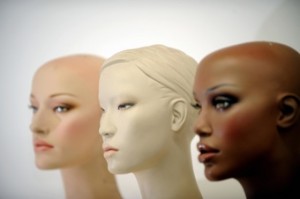
What do customers think when they see:


How do they associate themselves with this display?


A merchandiser presents far more than the good for sale, they are selling an IDEA.

What if they don't look like the mannequin?


There is very little difference between merchandise sold in different stores.


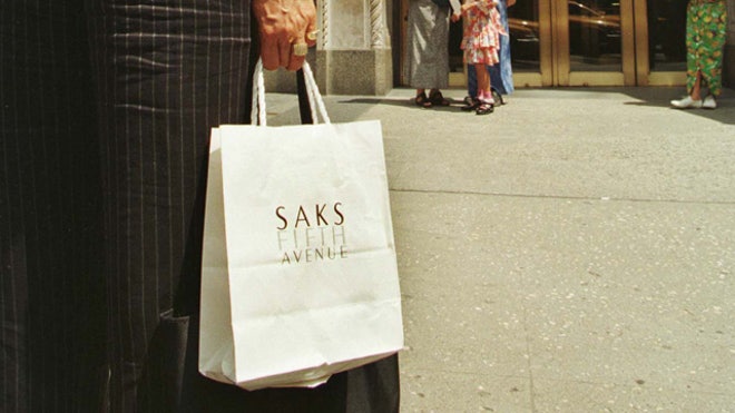
BRANDING is the reason that people like to carry around bags from certain stores.

They want to be associated with the IMAGE that the store represents - largely through it's Visual Merchandising.

What Can Displays Do?

• establish brand identity
• introduce a new product
• showcase a fashion trend
• educate customer about new ideas
• show how products can be used, worn or accessorized

A Display challenges the customer to enter the store, where there are opportunities to connect and make sales.

This is a Hands-on career. Although much can be done on computers in terms of layout and graphics, the Merchandiser is still working with three dimensional objects in a three dimensional space.


Key Skills are:

Analyzing
Planning
Creating

Buy your supplies. You will need to bring them to class each day, so you'll need something to carry them in. Supplies are due on Tuesday, January 21st.

Bring a flash drive to class on Tuesday, January 21st 

Sketchbook is due on Tuesday. There should be at least one entry in it.

Create an account on Pinterest. Create a Board entitled "Visual Merchandising," and pin three images that inspire you.


READ: Chapter 2 in the Textbook - color and texture, it is the handout I gave you. There will be a quiz on Thursday, January 23rd.

Order the Textbook. Bring it to class on Thursday, January 23rd.